Aniqa Afzal
Dr. Ravi Kuber - HCC 729 - Spring 2025
University of Maryland, Baltimore County
The Space Parking App Design Final Report
Table of Contents
Part I - About the Spaces Parking App UX Problems 2
Part II - Participants and Method 3
Rationale for Each Method Selected. 5
Part III - Participatory Design with Cognitive Walkthrough for Design and Prototyping Activities 6
Low Fidelity Prototypes- Designs of three wireframe screens of the Spaces parking app 6
Medium Fidelity Prototypes per Peer-Feedbacks 7
High Fidelity Prototypes in Figma and Cognitive Walkthrough Peer-Feedback 9
Personal Reflection and Conclusion 11
A.2 Interview Responses via Poll / Survey in the Slido app + Images. 12
A.3 UAR Transcripts with Nielsen’s Ratings 13
UAR #2: Help and Documentation 14
UAR # 3: Recognition rather than recall 14
A.4 Images of Low, Medium, and High Fidelity Prototypes 14
A.5 Images of University Parking Apps 21
A.5.1. Comparative analysis of the Space App’s design with Four Best Apps 26
A.6 Images (a-f) of the Original Spaces Parking App from (Spaces USA, 2025) 27
A.7 Initial Image of Two Personas and Scenarios for the Parking Spaces App 28
Persona 1: The Calm Non-Commuter 28
Persona 2: The Frustrated Commuter 29
Scenarios for the above Two Personas 30
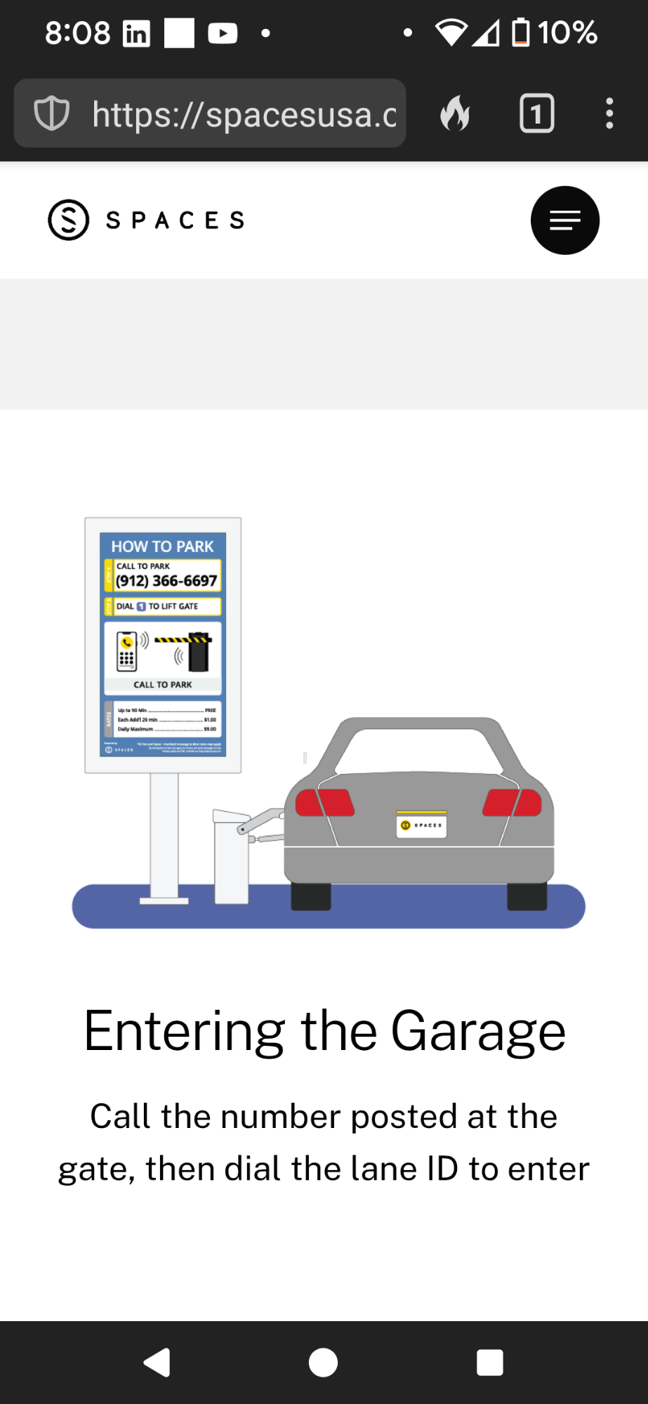
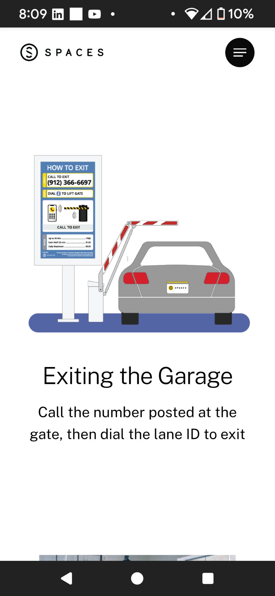
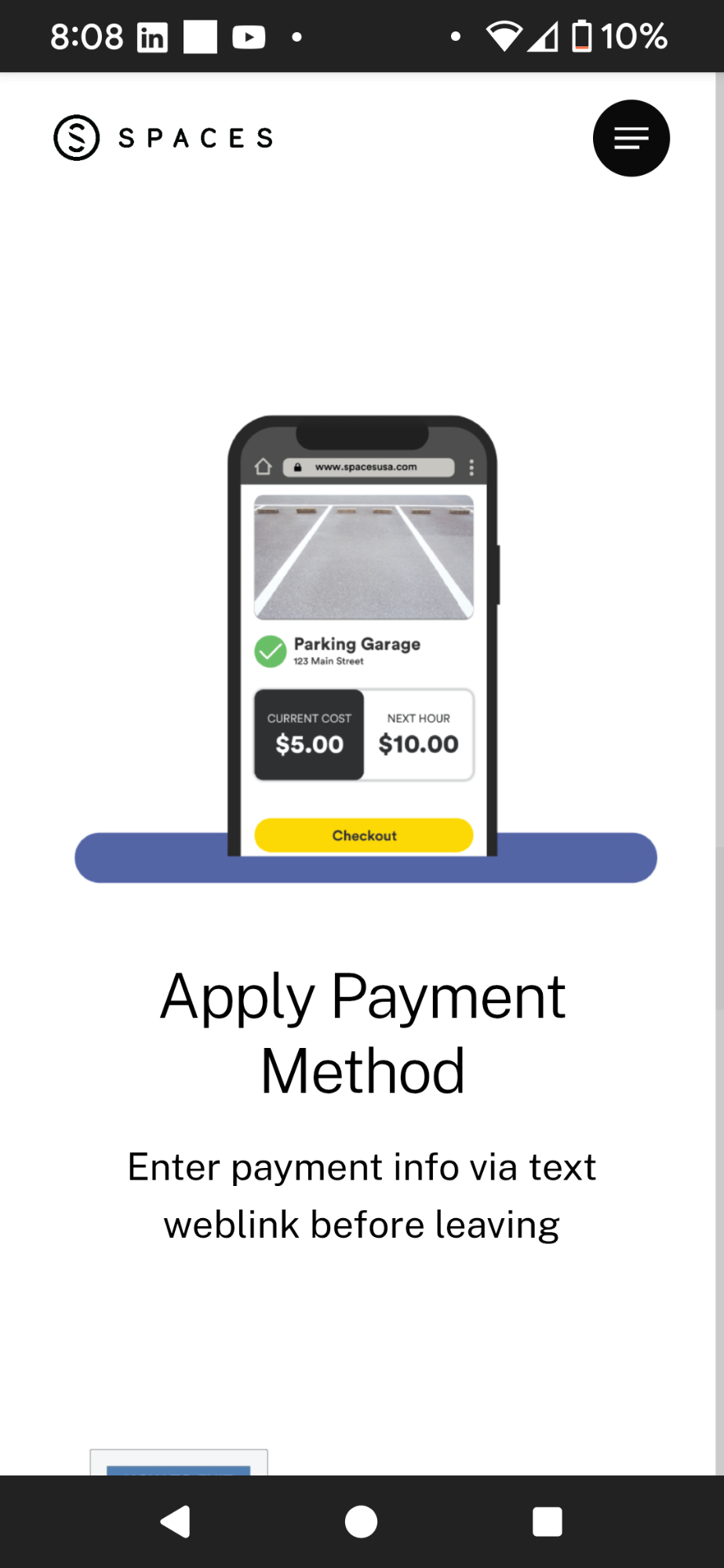
The Space Parking app facilitates touch-free parking management by enabling users to call staff for entry or exit or for the parking related assistance. This report conducts a comparative and heuristic analysis of the app’s user experience (UX) design and layout, benchmarked against four other parking systems, as detailed in the Method section. The analysis highlights the app’s transactional inefficiencies and usability issues, informed by Heuristic Evaluation (HE), Usability Action Reports (UARs), interviews/polls, cognitive walkthroughs and design insights. These methods identify critical features needed to enhance the Space Parking app’s appeal as a parking solution. While the app’s call-based system offers a novel approach, it poses challenges during time-sensitive situations, such as delays for users rushing to appointments. Alternative entry and payment methods are thus essential. The app’s usability goals—user satisfaction, utility, functionality, efficiency, and effectiveness—are prioritized for improvement (Dr. Kuber, 2024, The Design Process). User interview responses, contextual factors, and the app’s background further inform this redesign, with details available on the app’s website (Spaces, 2025, https://spacesusa.com).
Background.
The Space Parking app is an online platform for streamlined parking management. Its current call-based entry system and manual credit card payment process, lacking clear confirmation, create significant user frustration and inefficiencies. Past redesigns have made minor UI adjustments but failed to address core usability flaws. User research and evaluations underscore the need for a comprehensive redesign emphasizing simplicity and accessibility. For example, users visiting nearby restaurants or stores require a straightforward parking and payment process. However, the app mandates a phone call to enter, followed by a text form to input credit card details without a clear Payment Successful feedback, leaving users uncertain about transaction completion (Nielsen, 1993). If the gate fails to open, users must contact customer service, exacerbating delays and dissatisfaction because it is worse than Norman’s Door Designs complaints, where a Door cannot open or close due to push/pull related confusion associated with poor design (Norman, 2013). The absence of modern payment options, such as PayPal or card readers, and the lack of clear cost breakdowns or receipts further complicate the experience. There are visibility, mapping and utility issues as the users of Spaces app cannot find or locate what they want easily due to less tabs in the navigation bar that oftentimes do not match users expectations per negative reviews on the site and visibility or discoverability of the app’s utility and functionality are also a challenge. Per some users, feedback is very poor and often missing, making them wait longer to confirm from the staff. An unexpected or often unnotified charge for the unpaid parking sessions reflect deceptive dark-pattern design practices, contributing to negative user reviews and diminished trust. Other users may be commuter or non-commuter students who go to nearby universities and often visit the Spaces parking lot.
Identified Issues. Cognitive Walkthroughs, Heuristic Evaluations, and user interviews with Usability Action Reports (UARs) revealed critical usability barriers in the Space Parking app, some of which diverged from anticipated issues (see Appendix for UAR transcripts; interview questions). The primary issue is the outdated call-based entry and exit process, requiring users to wait for staff assistance, which delays parking and increases frustration, especially under time constraints. Contrary to expectations, the process’s inefficiency stemmed not only from wait times but also from inconsistent staff response times, a factor less prominent in initial hypotheses. The payment system further compounds issues, lacking a clear “Pay” button or confirmation feedback, leaving users uncertain about transaction status. Interviews highlighted user confusion over hidden fees, such as the overparking fee, which was unexpectedly charged and not transparently disclosed with the drivers, a problem more pervasive than anticipated due to its impact on trust. The app’s interface also obscures critical buttons, hindering navigation and interaction efficiency. Missing functionalities, such as QR code scanning or integration with modern payment platforms (e.g., Venmo, PayPal, or VISA), were identified as significant gaps, limiting accessibility and convenience compared to the four benchmarked parking apps in comparative analysis. Ideally, users may want the Spaces app to be more visually appealing with easy to find reviews, buttons, tabs and images or icons.
Implications of Issues. The call-based system and unclear payment process result in prolonged wait times, user dissatisfaction, and distrust, as evidenced by negative app reviews. The lack of transparent fee structures and confirmation feedback erodes user confidence. These issues collectively undermine the app’s usability goals such as efficiency, effectiveness, and satisfaction, making it less viable for users seeking quick, reliable parking solutions (Dr. Kuber, 2024).
Opportunities for Improvement. A comprehensive redesign offers significant potential to enhance the Space Parking app’s user experience. Implementing touch-free entry methods, such as QR code scanner or zone recognizer, would reduce wait times and streamline access. Integrating diverse payment options, including Venmo, PayPal, or GPay, with clear “Payment Successful” or “Payment Cancelled” feedbacks, would improve transaction clarity and accessibility. Disclosing all associated costs with zones and printing the “Receipt” button would eliminate hidden fees and build user satisfaction and trust. Enhancing interface navigation by making buttons more prominent and intuitive would further improve usability. These changes align with best practices observed in benchmarked parking apps, positioning the app as a competitive, UX solution. Further motivation behind evaluating the Space app can be observed in the Method section of this report.
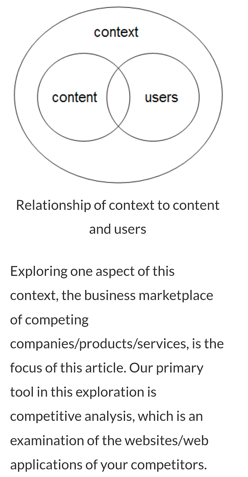
This study adopted a Participatory Design approach to enhance the usability of the Space Parking app, utilizing qualitative methods including interviews, Heuristic Evaluation (HE), Competitive Analysis, and Cognitive Walkthroughs. Heuristic Evaluation involves evaluators assessing the interface against established usability principles (e.g., Nielsen’s heuristics) to identify issues before user testing. This cost-effective method of HE was crucial for early detection of usability flaws, though it does not replace real-world testing; hence, other methods were used besides UAR and HE.. Competitive Analysis examined four alternative parking apps, focusing on content, context, and user experience (Withrow, 2006), to integrate best practices from leading apps, such as university parking systems, into the design. This step was vital for understanding modern usability solutions and streamlining user interactions. Cognitive Walkthroughs analyzed low and medium-fidelity prototypes by simulating user task flows and incorporating peer feedback, enabling iterative refinements to improve usability. These methods were selected for their ability to provide comprehensive insights into usability challenges, ensuring a user-centered design process through cost-effective evaluations, competitive benchmarking, and iterative peer-feedback, ultimately optimizing the app’s functionality before advanced testing and prototyping.
Polls/Survey and Interviews. This report presents findings from two interviews with users of the Space Parking App. The goal was to understand how users feel about the app, check if it helps them complete important tasks, and find missing features. Interviews focused on overall experience, identifying challenges, and collecting suggestions to improve the app.
Three people were interviewed per interviewer or researcher using interviews and a quick Slido Anonymous Poll or Q/A app for Immediate yes/no responses and then phone calls with verbal consent to participate anonymously and voluntarily with no harm involved for quick app test along with their responses were collected based of the images of the UARs template and ten Heuristics’ definition I sent them from my contacts app. The participants were friends in researcher’s contacts who never used this Space app before, so their responses were not biased by other external factors. Their initial quick responses and detailed opinions on the above Heuristic Evaluations were recorded as follows in quotes and images, where the first question was skipped as it is explained later. Each evaluator described a UAR describing each usability problem they encounter i.e. HEs are typically used to report problems; however, UARs can be used to report both the good and bad qualities of an interface in other usability evaluation such as the Nielson’s Severity Ratings used for Q1 analysis (Dr. Kuber, 2025, Lecture 6 Slide 33-36, Heuristic and Expert Evaluation).
Nielsen’s Severity Ratings as Poll’s Data Analysis Method. Based on the Nielsen’s Severity Ratings in Slides 33-36 in 2025 Lecture 6 by Dr. Kuber, the Severity Rating to UARs are assigned based on a combination of the following:
Per Dr. Kuber, 2025, Lecture 6 slides 36, additional Nielsen’s Severity Criteria used for analysing those Severity Ratings includes:
Looking at the above Nielsen’s Rating Scale, users rated the UARs defects (See A.3) in the space app and this is important when researchers cannot deploy and test the app right away that has poor functionality or violations of HE per users’ feedbacks and reviews. Additionally, the presence of dedicated help from these participants or users helped highlight the challenges that a user faces. It also helped match the designer's conceptual model with that of the user’s mental model on how a parking app should be redesigned and much of it was also compared to the UMBC parking space to improve and expedite processes’ speed. The app lacks an easily accessible “Ask for Help” button or a customer support option, making it challenging for users to resolve issues in real time. Introducing a visible help section with FAQs, chat support, or a direct contact option would alleviate user stress and improve the overall experience. Intended users were also those who continued to participate in the redesign process with cognitive walkthrough and helped revise it with their peer-feedbacks as they previously identified several problems with the usability and functionality of the app in the UAR transcript in A.3 of Appendices and A.2 Poll responses. Consequently, one of the intended users had to be a UMBC student who commutes and the other would be a non-commuter or non-student in order to get diverse opinions from those who travel longer distances and those who don’t to understand their perspectives of using an app that is meant to be redesigned to each the parking, payment and other “ask for help” processes.
Findings and Data Analysis
Discussion of User’s Interview/Poll Responses. As we can see in the images of Appendix A.2, most users do not get to complete tasks on app easily and efficiently which violates the Usability Goals and also Lacks the Necessary information they need to do so with like 100% users voting False to Q2. This aligns with response in Q3 as 100% users could not find information they were expecting or looking for. This also matched with the Heuristic of Visibility where all the needed information wasn’t visible/discoverable. The responses showed how users felt the entire Space app needs a Redesign with 100% voting Redesign it all in Q4. Similarly, In Q5, 100% voted Yes to finding confusing signs, texts, buttons, or symbols on the app that misled or confused users, making the researcher call users to obtain further clarification and explanation of their poll responses. After obtaining the initial yes/no responses from the polls, the detailed Heuristics UARs-based responses were gathered over a call to better understand what the space apps lack, explained under Known Problem Section below.
Perceptions of the Space Parking App. The Slido app collected initial responses to interview questions, with votes or answers analyzed using Nielsen ratings. Q1 was excluded from polling but included user ratings from calls, documented in UARs under the Known Problem Section (see Appendix A.2 for all questions and responses). These methods provided a comprehensive view of the app’s usability issues, guiding the redesign strategy, with their significance detailed in the Rationale section. Nielsen’s Severity Rating Criteria revealed that most users rated the app as having Major and Critical usability issues, with only one user identifying a minor Usability Blemish. These ratings addressed Q1, highlighting users’ overall impressions and identifying areas for further evaluation (Nielsen, 1993). Before sharing user’s preference of the competitor apps, below is a quick comparative analysis in Appendices A.5.1-2. sections.
There are numerous reasons to select multiple methods in order to fully understand the design and layout of the Space app. In order to evaluate each of its features using the Design Process with eventually testing the designs with prototypes, an app gets to be improved for future utilization. Therefore, the first method of Creating Personas and Scenarios were to have an estimate or approximate responses we predicted from a user who would use the space app based on our initial use of it. Secondly, the Interviews and Survey or polls used to interview actual users of the space app, only helped us confirm whether the app actually gave those responses. Then The whole idea with Heuristic Evaluation was the same to try and test each of the features that the actual users of this app complained about and see whether we could find an alternative parking app with better features that the space app may add. Hence, the Comparative Analysis of the four parking apps was necessary to compare and see what else was missing that it needed to incorporate in order to match the best practices and meet the Usability goals, Norman Design Principles, UARs and HE standards overall. A Primary Task analysis also helped understand how much time one could take with the number of steps involved, but since the Space app had just 4 tabs, it did not take long to explore it; however, those who are on hold in a call, might describe the whole experience differently than those using just app, so all Method were a must.
Evaluation. Low-fidelity prototyping, using tools like PowerPoint, was time-efficient, enabled rapid iteration, and facilitated early feedback to refine designs. These methods supported brainstorming solutions for complex issues like the call-based parking app. However, paper and slide-based prototypes lacked interactivity, limiting the ability to test dynamic features like QR scanning, so that was not used. Wireframes in slides enabled clear typed text and design with shapes to convey designer’s intent. High-fidelity prototypes addressed missing features to simulate real-time interactions per user feedback, collected from two contacts that volunteered to provide recommendations and suggestions to improve the app. To address the critical usability barriers identified in the Space Parking app—outdated call-based entry/exit, unclear payment processes, hidden fees, and obscured navigation (Dr. Kuber, 2024), three low-fidelity prototypes were designed for desktop and cellphone interfaces. These prototypes, created using PowerPoint wireframes, target core user tasks to enhance efficiency, transparency, and satisfaction. Three screens are detailed in (Appendices A.4.a–A.4.c), with annotations highlighting changes based on the Known Problems section.
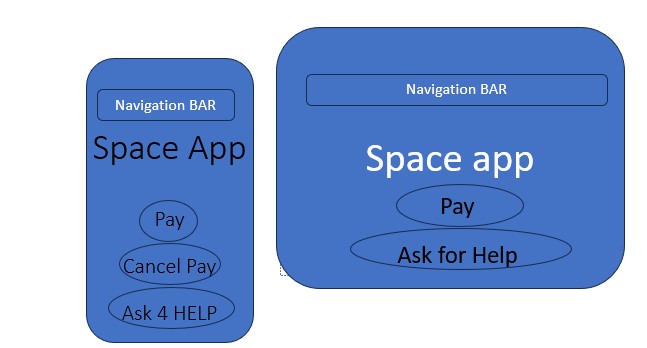
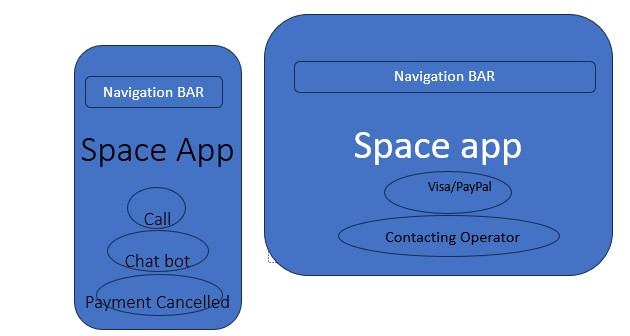
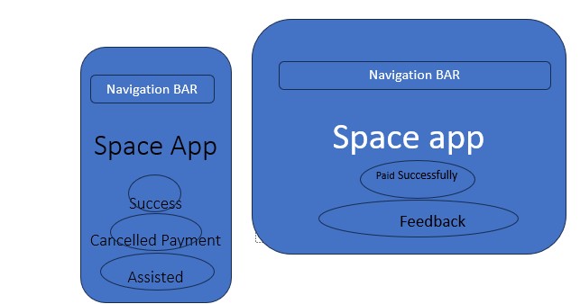
Prototype Designs and Focus. The first prototype (Appendix A.4.a) is a landing screen featuring a prominent "Pay" button and a "Scan QR Code" option in the bottom bar, replacing the inefficient call-based entry system to streamline parking access. A top navigation bar includes "Home," "About," "Costs," and "Permits" tabs, ensuring consistent, intuitive access across pages. The second prototype (Appendix A.4.b) displays payment options (e.g., PayPal, Venmo, Visa) with a "Cancel Pay" button, addressing the lack of clear payment initiation and user error recovery. The third prototype (Appendix A.4.c) provides a "Payment Successful" or "Payment Cancelled" confirmation notice, incorporating transparent fee details (e.g., overparking fees) to build trust. These prototypes were prioritized because they directly tackle the primary issues, entry delays, payment ambiguity, and hidden costs, identified through cognitive walkthroughs and user interviews (Dr. Kuber, 2024). Appendices note specific improvements, such as enlarged buttons for visibility and a "Costs" tab for fee transparency. Moreover, the buttons were not distinguished from notices in low fidelity prototypes.
Cell Phones/Mobile Adaptations. For mobile interfaces, the desktop prototypes were restructured for smaller screens. The landing screen’s navigation bar collapses into a hamburger menu, with the "Pay" and other buttons centered for thumb accessibility. The payment options screen uses a vertical layout, prioritizing essential buttons ("Pay," "Cancel Pay" etc.) and integrating faster payment options. The confirmation screen employs larger fonts and a simplified receipt view for readability. Low Fidelity Prototype Three Screens are visible in (Appendices A.4.a–A.4.c) that illustrates these adaptations, designed to maintain functionality. These changes ensure accessibility and efficiency on mobile devices, aligning with benchmarked parking apps.
Testing and Participant Selection. The prototypes were tested with two participants, selected via convenience sampling from researcher’s contacts, but different backgrounds to represent different user profiles (e.g., commuters vs. non-commuters). Usability testing involved task-based scenarios in a cognitive walkthrough next, such as completing a payment or Go to maps. Participants provided verbal feedback, and interactions were observed to identify usability flaws and violations of any HE principles.
Participant Feedback. Participants praised the buttons added and overall prototype, but both participants suggested adding better feedback and distinguishing buttons from notices or supposed pop-up. The "Costs" tab was well-received for transparency, though one participant requested a fee calculator for overparking estimates. Mobile adaptations were appreciated for their simplicity, but one user noted the hamburger menu was too small to read or understand.
Screenshots. All low-Fidelity Prototypes can be seen in Appendix A.4.a-c, created in MS PowerPoint.
Peer Feedback 1: Per participant #1 comments on the low-fidelity Prototype,
“Refund or Cancel payment should appear on the final step of payment, not when we click pay. So once paid and parking ticket is purchased and parking is alloted, but before parking, the Cancel pay button will appear. Feedback can appear after cancel payment or on the process overall like ratings that Payment Process was easy or hard, Cancel/ refund was easy or hard. Add more options for payments such as: Visa/PayPal/Zelle/Cash/GPay/ Venmo/Mastercard. If possible in the future, include a promo-code to cut costs.”
Peer Feedback 2: Per participant # 2 comments on the low-fidelity prototype,
“Overall a great work, as I'm not sure about the working of the real app or the actual screens that are already there in such machines, I can't comment much on other features. But I guess you've to create 3 prototypes (1 or more screens for each prototype) related to 3 different tasks.You can add a few more components and make it more consistent throughout the screens. You can make these buttons look more like a button by using rectangles (with rounded corners) and using a different color for the buttons. And make all the buttons of the same size to maintain consistency. In the first screen, what is the 'Payment Cancelled' button for? I guess it should be more like a message or notification rather than a button itself. Same for the 'Contacting Operator' - it should be more like notification/message than button. You can put the options (Home, About, Contact, etc.) in the 'Navigation Bar' instead of just labelling it as such. Overall, the prototype looks very clean, simple and easy to understand and use, however I would suggest making it a bit different by using 2-3 colors at max and also changing the background color to something less saturated.”
Evaluation. The medium-fidelity prototypes for the parking app were developed to address peer feedback from low-fidelity prototype testing, focusing on enhancing three core tasks: payment processing, navigation, and feedback collection. These prototypes incorporated significant refinements to improve usability, accessibility, and functionality while laying the groundwork for cross-platform adaptation. By addressing specific feedback, integrating new features, and applying design principles such as Fitts’ Law and Norman’s Design Principles, the prototypes aimed to deliver a more intuitive and user-friendly experience. The following sections detail the changes made, their impact on the design, additional enhancements, and considerations for adapting the prototypes across desktop and mobile platforms.
Prototype Designs and Focus. The payment processing functionality underwent substantial improvements based on peer feedback. To enhance button design and consistency, as suggested in Peer Feedback 2 (Participant #2’s feedback), buttons were redesigned as rectangles with uniform sizing and distinct colors to clearly indicate interactivity. The "Payment Cancelled" and "Contacting Operator..," were kept as round-shaped notifications or pop-up messages to reduce confusion while “Pay”, “Call” and “Ask for Help” were changed to rectangular buttons, ensuring users could distinguish them from feedbacks that appear once a button would be clicked in high-fidelity prototypes. Following Peer Feedback 1 (Participant #1’s feedback), payment options were expanded to include Visa, PayPal, Zelle, Cash, GPay, Venmo, and Mastercard, replacing the limited Visa/PayPal-only options from the low-fidelity stage. This expansion accommodates diverse user preferences, increasing accessibility. The navigation bar was also enhanced, incorporating options such as Home, About, Contact, Cost, and Permits, as recommended by Peer Feedback 2, to improve accessibility across the app. To support users with disability parking permits, a "Zone" feature button was introduced to clearly indicate relevant parking zones, ensuring inclusivity. Additionally, the "Ask for Help" button was made larger and more prominent than others, applying Fitts’ Law to improve clickability and usability by making key functionalities easier to locate, directly addressing low-fidelity feedback about button discoverability and faster accessibility to it by all users.
Navigation and Map. Navigation and mapping were refined to provide better guidance and a cohesive user experience. A placeholder Maps in top bar image or icon was integrated into the medium-fidelity prototypes, responding to low-fidelity feedback about the need for improved driver guidance, with plans to fully implement this in the high-fidelity stage. The navigation bar was updated to maintain consistency with Prototype 1, ensuring a unified interface across all three to four screens. To enhance interactivity, visual cues were introduced: button colors now lighten on hover and darken on click as shown in images in (Appendix A.4.d.) providing clear feedback to users about their actions. These changes improve the intuitiveness of the interface, making navigation fun and engaging for users.
Participant’s Feedback. The feedback process was redesigned to incorporate low-fidelity feedback about the need for effective user input methods. The medium-fidelity prototypes include the intent to integrate quick polls via the Slido app in the high-fidelity stage, displayed on the final screen to collect feedback on aspects such as ease of payments, cancellations, refunds, call assistance, navigation, error recovery, cost transparency, and overall app functionality. In the medium-fidelity stage, this intent is represented through placeholder designs. Reviews and ratings are now presented as pop-ups, enabling users to prioritize relevant feedback, such as issues related to payment cancellations or refunds. The final screen emphasizes notifications over buttons to streamline the interface, reducing complexity and confirming task completion. Incorporating the Slido polls for reviews, could enable anonymous and efficient feedback on Spaces app, aligning with usability goals and Norman’s Design Principles. Additionally, swipe-able reviews, navigable to the left or right, allow users to focus on relevant feedback to the challenges they may be faced with as a user, further enhancing the user experience by minimizing cognitive load to search
Changes made and why they are better. These changes significantly improve the design by prioritizing usability and clarity. The Slido-based feedback system’s review process will not only make it easier for users to provide input anonymously but also encourage honest responses. The minimal-button design on the final screen reduces interface clutter, confirming task completion and aligning with usability principles. The expanded payment options and clear zone information cater to a broader user base, while the enhanced navigation bar and visual cues improve accessibility and interactivity. The application of Fitts’ Law to button sizing ensures that key actions are easy to perform, enhancing overall efficiency. Beyond the feedback-driven changes, additional enhancements were made to refine the medium prototypes. Content was improved by adding detailed labels for interface objects (e.g., Home, About, Contact, Cost, Permits, and Map) in the Navigation Bar on each screen, and buttons (e.g., Pay, Cancel Pay, Ask for Help) on the first screen, increasing visibility and transparency for users to find information quickly. The layout was reorganized to position critical information, with a top bar displaying cost and zone information and a map visual highlighting permit zones. Functionality was further enhanced by implementing hover and click color-changes for buttons, providing immediate feedback to users of action.
Device-Screen Adaptations. To ensure the prototypes are adaptable across platforms, considerations for transitioning from desktop to mobile and vice versa were incorporated. For mobile adaptation, the navigation bar would collapse into a hamburger menu to conserve screen space, prioritizing essential options such as Home, About and other tabs along with the “Pay,” and “Ask for Help” buttons resized to accommodate touch interactions, maintaining Fitts’ Law principles with larger tap targets that adjust based on screen size are going to appear more appealing to click. The map would display a condensed view in a cell phone, focusing on the user’s current location and permit zones, with a tap-to-expand option for accessing full details or searching zones would be added in high-fidelity. Conversely, the desktop version expands these features, featuring larger text and buttons arranged horizontally rather than vertically to utilize the additional screen space. Reviews are fully displayed in the high-fidelity desktop version, ensuring users can access comprehensive feedback without excessive scrolling. These adaptations ensure the prototypes remain user-friendly across different devices, balancing content and interactivity based on size constraints
Usability Goals. Based on this evaluation of the medium-fidelity prototype, a significant improvement to the design from the low-fidelity prototype’s peer-feedbacks can be observed, addressing peer feedback through specific edits made to payment processing, navigation, and feedback the app would give. By incorporating diverse payment options, a consistent navigation bar, and innovative feedback mechanisms like Slido polls, the prototypes may enhance both the usability and the accessibility. Additional changes to content, layout, and functionality further refine the user experience, while cross-platform considerations ensure adaptability across desktop and mobile environments, without compromising any of the features. These refinements align with the app’s goals of efficiency, utility, functionality, clarity, and user satisfaction, setting a strong foundation for the high-fidelity prototype.
Screenshots. Screenshots of the medium-fidelity prototypes, created in PowerPoint, are included in (the Appendix A.4.d-g). Annotations highlight changes such as button redesigns, navigation bar updates, map integration, and feedback pop-ups, demonstrating how low-fidelity feedback was addressed in the medium one per both users / peers’ feedback.
Evaluation. Several steps were taken to evaluate peer-feedback and prototypes. The evaluation of the parking app prototypes was designed to assess usability, functionality, and user satisfaction through structured tasks and participant feedback. Three primary tasks were defined for the cognitive walkthroughs: completing a payment, navigating through Maps, and Ask for Help or Chat with an AI bot. Participants were guided through each screen of the prototypes, encouraged to perform these tasks, and encouraged to verbalize their thought processes to provide insight into their experiences. The evaluation included targeted questions focusing on the ease of locating buttons, understanding notifications, and navigating the interface as shown in Table 1 and 2 in Appendix (A.4.L Tables Cognitive Walkthrough). To ensure comprehensive data collection with small notes were taken with participants’ consent and voluntary participation to test Figma-created-functional prototype. This methodical step-by-step approach allowed for an in-depth understanding of user’s interactions and highlighted areas for improvements.
Process. The evaluation process incorporated both cognitive walkthroughs and semi-structured template-based interviews to gather detailed insights. Both participants were interviewed separately by sharing Figma Prototype link with them, and they participated in the cognitive walkthroughs, interacting with the prototypes while also comparing them to the original parking app and a competitor’s app. The interviews explored usability, layout, and content, while the cognitive walkthroughs provide quick feedback on user interactions and functionality of the app. Questions focused on the ease of completing payments, the clarity of navigation, and the effectiveness of feedback mechanisms, a working map screen at the end, and trying all Asking for help options in the app. Participants found the prototypes more intuitive than the original app, particularly due to the expanded payment options and the clear map feature. The navigation bar had more options than the original app’s four tabs only in the navigation bar.
Participant’s Feedback. Feedback from participants was mostly positive, with several features receiving praise for their intuitive design. Navigation bar was noticed for its ease of use, enabling participants to move seamlessly between pages. Several payment options were appreciated for accommodating various user preferences, and the map feature was visualized so that it provided clarity on most missing features from previous prototypes such as “Search Zone” “Costs” etc., hence, making it easier for users to identify appropriate parking areas or find nearby places. However, constructive feedback highlighted areas for refinement. Some participants found the feedback of the clicked buttons in Prototype’s screen 3, did not stay but had to be long pressed to be viewed and should have been a tap or click instead of hover; therefore, suggesting a need for a more streamlined presentation of high-fidelity prototype. Additionally, one participant verbally proposed adding a “Back” button to enhance navigation efficiency. A minor utility issue arose with the “Chat with an AI Bot” type box as well, because Peer 2 expected it to talk back and work as most chatbots respond, but it didn’t work, giving one, “No, action is not available.” Both users were content that all four screens are connected, so the prototype seemed to work smoothly.
Room for Improvement. The feedback proved highly valuable in identifying both strengths and areas for improvement. The intuitive navigation and payment features were confirmed as effective, aligning with the app’s goals of efficiency and user satisfaction. However, limitations were noticed when comparing the prototypes to competitors, particularly the absence of real-time parking availability updates, a feature participants may have valued highly. Feedback was consistent between participants as the recommendations derived from their feedback aimed to enhance usability and address recurring themes. To simplify the feedback interface, the number of simultaneous pop-ups in long-press screen 3 should be reduced to prevent overwhelming users and avoid confusions. Navigation can be improved by adding a “Back” button and Cost-related information should be displayed more prominently and not just in the Map to ensure users can quickly access pricing details. Incorporating real-time parking availability updates would align the prototypes with competitor offerings, enhancing its competitiveness. These recommendations address the key findings from the evaluation, ensuring that the parking app prototypes evolve to meet user expectations. By enhancing navigation bar tabs to be clicked separately, and incorporating real-time features, the app can achieve greater usability and satisfaction. The Low fidelity designs may not be aesthetically appealing; whereas, even though the high fidelity ones took time to complete, they were more visually appealing per both participants and clear to follow. The low ones were also not easily understood by most, while medium and high prototypes were self-explanatory. Other short-coming of the low and medium prototypes were addressed in detail with cognitive walkthroughs.
Transcripts of the cognitive walkthrough. These are included as tables in the (Appendix A.4.L), detailing participant interactions and feedback.
Screenshots. Screenshots of the High-fidelity prototypes in Figma, are in the (Appendix A.4.h-k).
The design Process didn't go as envisioned due to several feedbacks to improve the low fidelity prototypes but since I designed for both Android compact cell phones and Android Medium tablets, they medium fidelity prototype messes up several times which couple users complained about in Figma, but if the device screen was changed by them to Android Medium, it worked fine for tablet but also kept showing cell phone smaller screen with extra black empty screen on its right. In Final Design, both prototypes will be kept separate for different sizes of devices. The process was a bit challenging as I was new to Figma and learned and used this design tool for the first time with the help of online resources. However, I did obtain the data I needed and if these steps were to be done again, I would definitely include a detailed Hierarchical Task Analysis for each step. This is important to understand what users would do and in what order to understand their priority and preferences of using the spaces app or search the parking spots that corresponded to their zones. Overall, we would like to conclude that the several methods used to analyze the app were a great approach to understand the app’s improvements in layout, UX design, aesthetics and UARs etc because we did get some valuable insights from users and interviewees, but if the steps were to be done differently, we would like to do the Primary Task Analysis Times and included into those Interviews in the future so that way we could have seen how much time did each user take to find the space app buttons and navigation tab verses contact or payment information, and then compare with the four best apps. There needs to be further testing of the space app's new design to better understand the shortcomings and improve them in order to make the high-fidelity prototype launch.
I thank my friend, Ling Zhang for getting me started with this topic and informing all about the challenges faced with utilization of the Spaces Parking app and its parking lot driving space as I had never used and evaluated this app prior to taking the Design course and writing this report. I relied on her essentially detailed reviews for the Parking Lot entry and exiting arduous processes, particularly for the payment-related app’s Utility, Efficiency, and Functionality issues. I also thank my friend Bishal Kumar Sah for his useful, design-focused, thorough and well-detailed expert feedback during the Cognitive Walkthrough processes for all three Prototypes besides my dad’s important feedback that significantly helped me improve all low prototypes into high ones, and redesign app to meet user’s mental model and needs. Lastly, this report was possible with the constant support, feedback, and encouragement from my faculty advisor of HCC 729 course, Dr. Ravi Kuber as it got completed in time due to him granting me a week extension for my conference trip where I learned about better designs. Thank you to all contributors.
________________________________End of the Report____________________________________
CCBC Parking Permits. 2025. CCBC. Retrieved from: https://www.ccbcmd.edu/About/Contact/Locations/pages/Parking-and-Transportation.html
Dr. Kuber, R. (2024). Lecture 4: Weekly Deliverable 4. UMBC:BlackBoard.
Dr. Kuber, R. (2024). “The Design Process.” UMBC Blackboard Slides.
Dr. Kuber, R., & Mentis, K. (2024). “Lecture 5: Task and Environment Analysis Scenarios & Personas.” UMBC-Blackboard.
Dr. Kuber, R. (2025). “Lecture 6: Heuristic and Expert Evaluation.” UMBC:BlackBoard.
Dr. Kuber, Ravi (2025). “Week 7 Slides:Participatory Design.” UMBC: BlackBoard.
Dr. Kuber, Ravi (2025). “Week 9 Slides: A/B Testing, Analytics, Predictive Models & Cognitive Walkthrough.” UMBC: BlackBoard.
Dr. Kuber, R. (2024). “Understanding Systems Use in Context Field Data Collection 1.” UMBC.
“Figma Prototype AA.”(2025). Figma. https://www.figma.com/design/BnFOTWcdqbneH95xDlPOF9/Spaceapp-AA?node-id=0-1&t=dMDUwo5mi8WJFGR-1
“Johns Hopkins University Parking.” (2024). JHU https://jhfre.jhu.edu/ts/parking/ .
Nielsen, J. (1993). “Usability Engineering.” Academic Press.
Norman, D. A. (2013). “The Design of Everyday Things (Revised and Expanded Edition).” Basic Books.
“Park Mobile app.” (2025).Park Mobile. Retrieved from: https://app.parkmobile.io/search/baltimore-md-usa-parking
Prototype Link: https://www.figma.com/proto/BnFOTWcdqbneH95xDlPOF9/Spaceapp-AA?node-id=0-1&t=qgEQpgPK8qZ1yz8N-1
Slido Live Q/A Anonymous.[Online] Retrieved from: https://www.slido.com/features-live-qa Slido app.
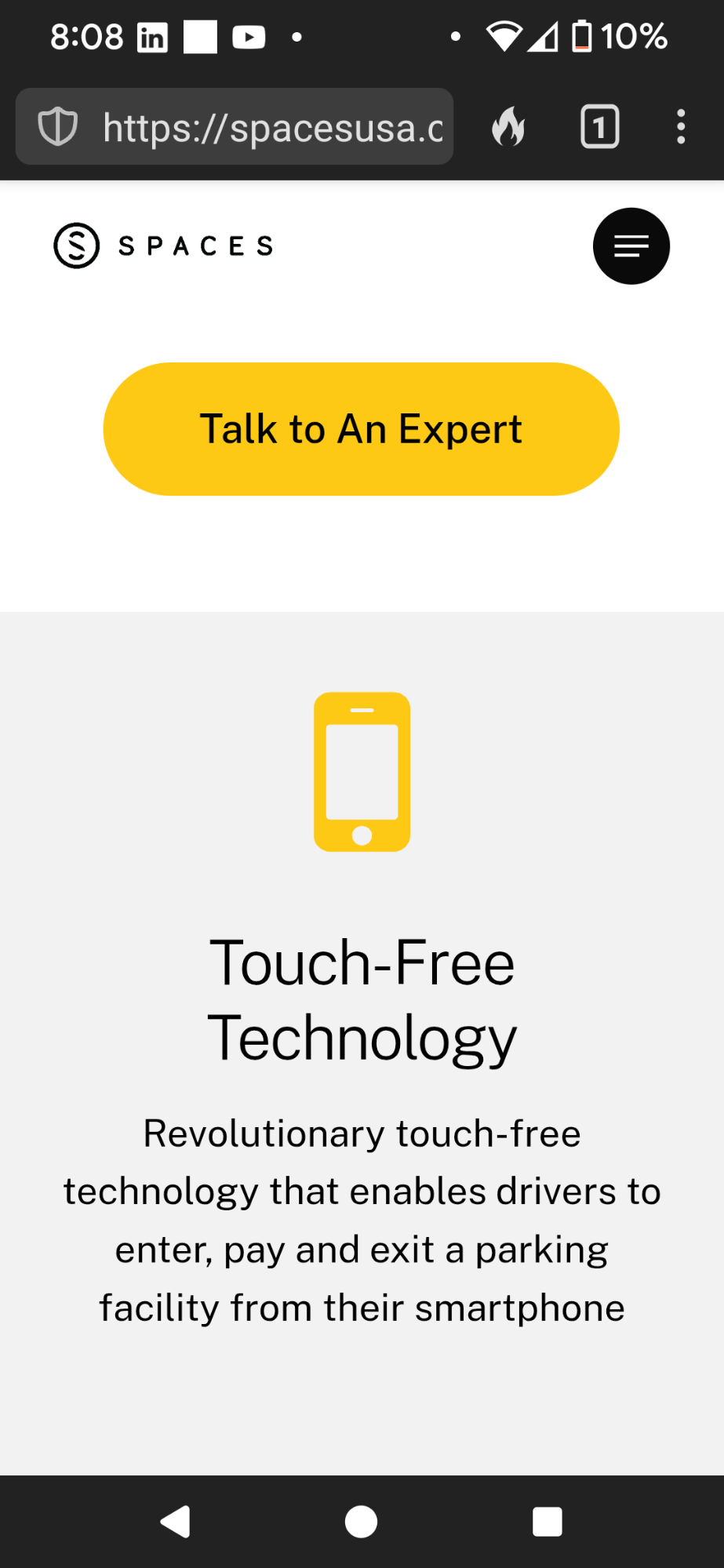
Spaces USA. (2025). Retrieved February 22, 2025, from https://spacesusa.com
UMBC Parking Services. 2025. UMBC. https://parking.umbc.edu/
UMB Parking App. 2025. UMB. https://www.umaryland.edu/parking/
Withrow, J. (2006). “Competitive Analysis: Understanding the Market Context.” Boxes and Arrows.
https://boxesandarrows.com/competitive-analysis-understanding-the-market-context
The interviews were semi-structured to allow detailed answers while staying on topic. Key questions are:
1. What are your overall impressions of the Space Parking App?
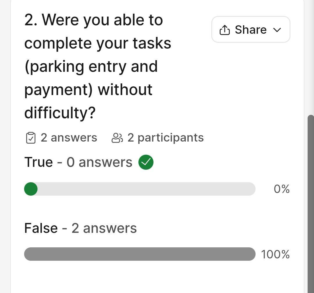
2. Were you able to complete your tasks (parking entry and payment) without difficulty?
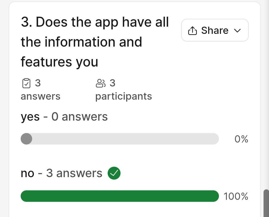
3. Does the app have all the information and features you expected?
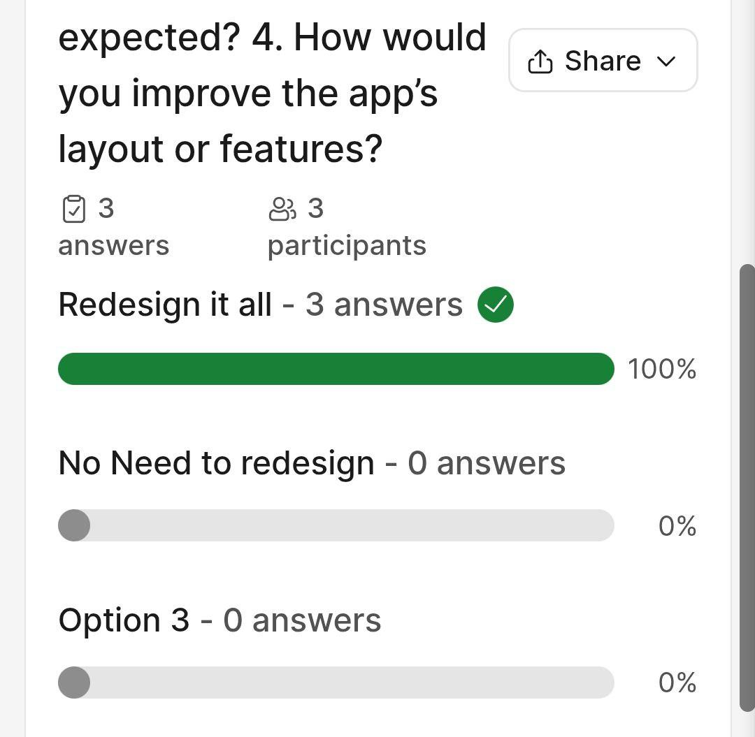
4. How would you improve the app’s layout or features?
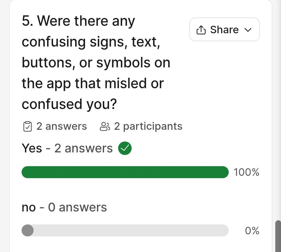
5. Were there any confusing signs, text, buttons, or symbols on the app that misled or confused you?
Q1. skipped in poll: What are your overall impressions of the Space Parking App? (For Q1, See Ratings Analyzed in Known Problems).
Q2. Were able to complete your tasks (parking Entry or payment without difficulty? (Per polls, 100 %responded to this as False)
Q3. Does the app have all the information and features you need (100% said no)
Q4. How would you improve the app’s layout? (100% believed the Space app must Resign it all).
Q5. Were there any confusing signs, symbols, buttons, links or text that confused you? (100 % responded Yes to this question).
Slido Polls:
a.b.
c. d.
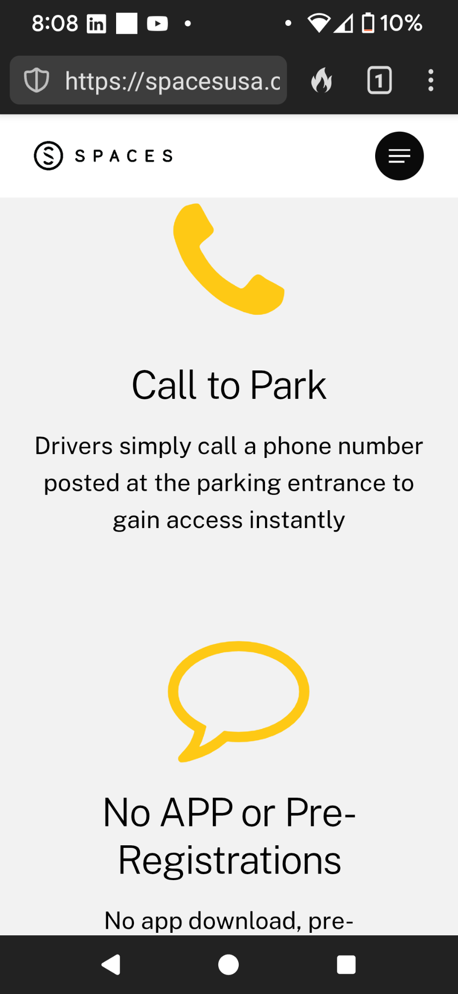
Evidence: “One of the biggest errors on the website is the lack of buttons working as expected. For instance, when I hit the ‘Talk to an expert Button’ which is the largest button, I expected it to prompt a number to call via phone, but instead it appears like an error because it prompted me to fill a form as both the navigation and ‘Talk to an Expert’ button lead to the same ‘Contact Us’ form.”
Nielsen’s Severity or Benefit Rating Justification (Q1) and Analysis:
Evidence: “The Documentation of this app is poor and just like its layout. The Help options are hidden. The layout focuses on providing App’s Ad first with tons of documentation on How the space parking works but there is none that says, "how can I help you or customer help that I may read.”
Severity or Benefit Rating Justification (Q1)
This user and I (researcher) agree that the Aesthetics and Minimal design of Space app appears frequently with a ton of irrelevant information in wrong places or layout of the app, requiring scrollings.
Evidence & Explanation: “Navigation Bar has four tabs that require less recall. First page is used mostly.”
Severity or Benefit Rating Justification (Q1)
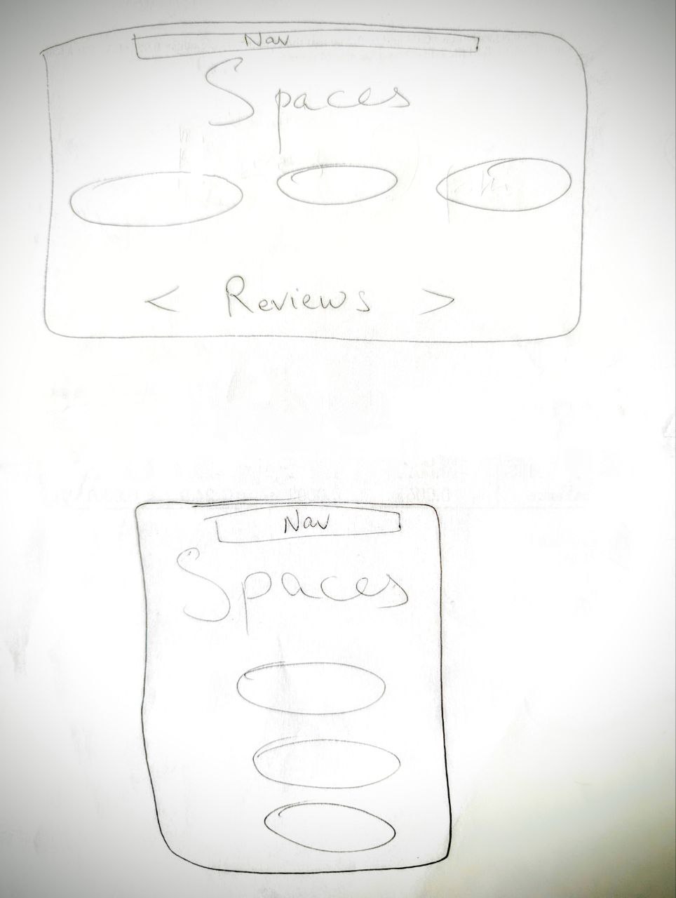
Low FidelityPrototypes on Paper
Fig. i. Tablet vs. cell phone on paper as low-fidelity prototype
Low Fidelity Prototypes on Powerpoint (Three Screens)
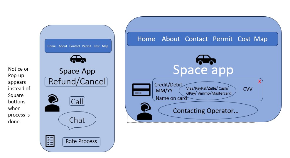
Menu. The Navigation bar is consistently on top of each page, regardless of device size.
Buttons. Three major buttons on each device screen one of Space app are:
This is the options tab to either call or chat when clicked on Ask for help and select payment type.
Screen three:This is just the final screen showing all confirmation notices or pop-ups for previous actions.
________________________________________________________________________________ Medium Fidelity Prototypes in Powerpoint (Four Screens)
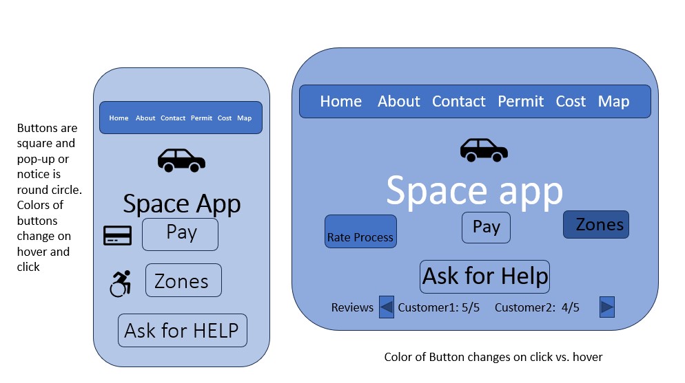
Screen One Revised: Changed the shapes of buttons and notice or pop-up messages are square versus round circles. Colors also would change on hover is lighter and on a click would be darker. I added a Zone because those with a disability would have different parking permit zones. I detailed the Navigation bar per participant # 2’s comments.Reviews are now on the front page for the parking app users to see the feedback and ratings from easy or hard payment processes as well as the cancellation and refund. The Ask for Help Button is made prominent and big for Fitts’ Law to strengthen them based on the low-fidelity evaluation. Why this is better: This is better because I want users to be able to click faster and find the functionality and buttons easily on the app. This would expedite the parking and payment processes.
Screen Two Revised: Added more options for payment such as PayPal, Visa gift card, GPay, Zelle, Cash, Venmo and Mastercard per first participant’s feedback because this would be convenient to users of the app and to strengthen them based on the low-fidelity's comments on simple payment option button of Visa/PayPal. Why this is better: This would be better because not only would a user want more payment options but also everything efficiently opening as a payment form such as that on clicking a Visa gift card versus PayPal Login screen versus a Cash option in-person for the user to make a payment via cash on the exit location place into a machine to speed up the process and avoid waiting for someone to come and collect cash. These payment options can also be done via calling an operator, but that is not the only method of payment, hence making the process easier.
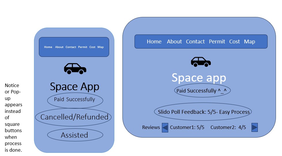
Screen Three: I have incorporated Slido App quick polls for feedback on the last screen that will appear. It does not have a lot of buttons but it has more of pop-ups or notices and Reviews or ratings that would show users how easy or difficult it is to use the app, make payments, cancel or refund payments before parking car or get payment confirmations and call assisted feedbacks to strengthen them based on the low-fidelity evaluation. Why this is better: Feedbacks are crucial and important at the end as they confirm the process has completed. Reviews can be moved right or left and that is better so users can view the comments or ratings most relevant to them or the process they want to learn more about since the Slido poll will ask rating from easy to hard on each of the following steps: Payments, Cancellations, Refunds, Call Assistance, Navigation, Efficiency, Recovery from Errors such as any 404 page etc. back into Home screen of the App, Transparency of Costs associated with Zones in top bar and Zones via Map Visuals and Markings and Functionality overall in estimated 3 minutes with Stars, Scores (5/5, ⅘, etc), and easy to hard sliding scale at the end of process. These feedbacks and Reviews are better to be collected with Slido as it is faster with QR codes or Poll ID number incorporated into the Space app, help improve the Useability goals and Norman Design Principles of the Space App, and also helps collect users’ input anonymously.
Screen Four Added: Specific layout of interface objects:
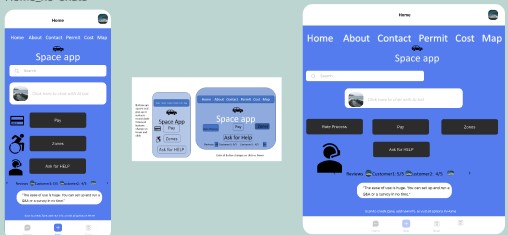
High Fidelity Prototypes in Figma (Four Screens)
Screen One Revised in Figma: Included all feedback from the Medium Fidelity Prototype in Slides into Figma to create a High fidelity Prototype that would go from one screen to the next on clicks. Pay, Zones, and Ask for Help Buttons are made prominent and big enough according to the Fitts’ Law to strengthen design based on the medium-fidelity evaluation and peer-review. There are some additional features included depending on the space such as three buttons at the bottom navigation bar to help users easily scan a QR code to find out their parking zone/permit. Why this is better: This is better because we want users to be able to click faster and find the functionality and buttons easily on the app. This would expedite the parking and payment.
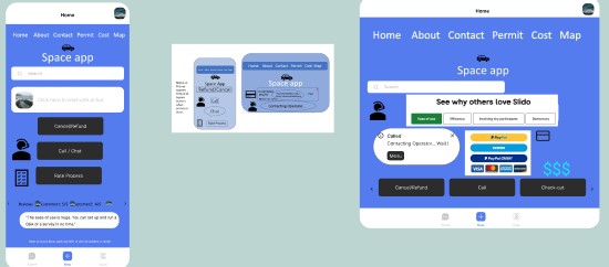
Screen Two Revised in Figma: I have added more options for payment such as PayPal, Visa gift card,, Venmo and Mastercard etc., which will appear on the next screen once users click on Pay button in Screen One. This would open either the options screen in both devices, it is better because this would be convenient to users of the app. The Rate Process button in the previous screen will bring to this screen to have users rate payment and parking process in Slido with an easy to hard. However, The image I took now from Slido shows a slightly different rating scale, which I could change to show Ease of Use, Efficiency, Hard Process, Difficult Process in my Slido app poll. This screen pops up the PayPal form and returns to either the same or next screen in prototype. Why this is better: This options screen is better because not only would a user want more payment options but also everything efficiently opening as a payment options on clicking the card icon to proceed to the payment forms after selecting their choice from the options list such as a Visa gift card versus PayPal versus a Cash option in-person for the user to make a payment via cash on the exit location place into a machine to speed up the process and avoid waiting for someone to come and collect cash. These payment options can also be done via calling an operator, but that is not the only method of payment, hence making the process easier.
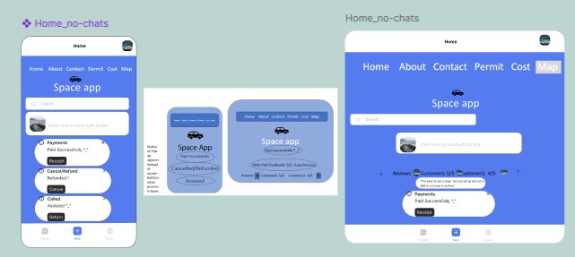
Screen Three in Figma: I have incorporated Slido App reviews from user feedback on this screen that will appear. It does not have a lot of buttons but it has more pop-ups or notices such as Paid Successfully from previous Screen Payment method process and Cancelled/Refunded notice, and called or “Assisted ^_^” like notices based on what the user selected. The Reviews or ratings that would show users how easy or difficult it is to use the app, make payments, cancel or refund payments before parking their car or get payment confirmations or receipts. Notice how the Map Tab in the top navigation bar is selected, so it will take to the next screen of the Maps. Why this is better: Feedbacks are crucial and important at the end as they confirm the process has completed. Reviews can be moved right or left and that is better so users can view the comments or ratings most relevant to them or the process they want to learn more about since the Slido poll will ask rating via “Rate Process” button from easy to hard on each of the following steps: Payments, Cancellations, Refunds, Call Assistance, Navigation, Efficiency, Recovery from Errors such as any 404 page etc. back into Home screen of the App, Transparency of Costs associated with Zones in top bar and Zones via Map Visuals. These feedbacks and Reviews are better to be collected with Slido as it is faster, helps improve the Usability goals and Norman Design Principles of the Space App, and helps collect users’ input anonymously.
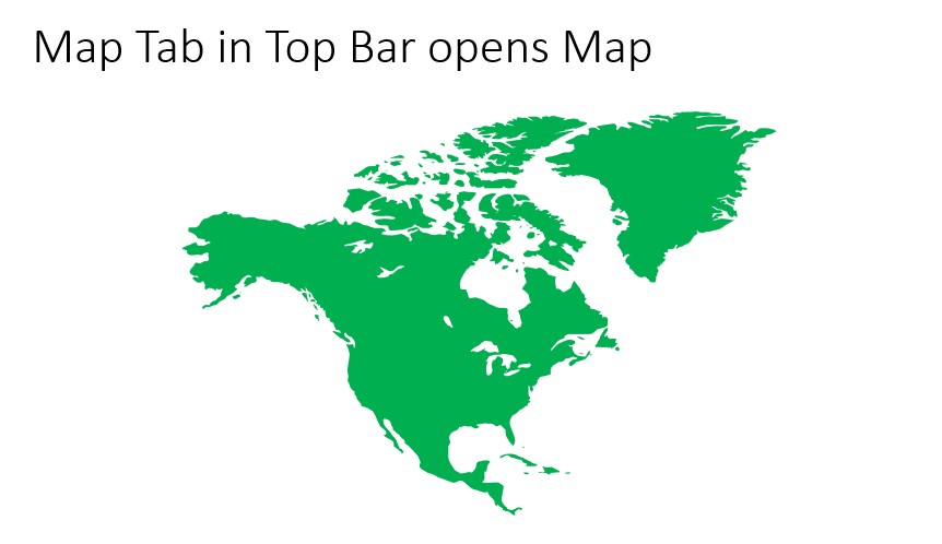
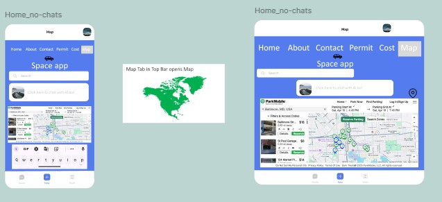
Screen Four, Map tab in top Navigation Bar Map objects: Map will have Precise location or approximate options and Directions to desired locations via Google Maps, Especially Permit Zones marked to help guide drivers as well as Search Zones options just like the ParkMobile app that UMBC uses and other best practices utilized. This is better to help guide users who use GPS so they can find directions or copy paste and send their addresses to friends who they want to meet at the parking lot and go to nearby restaurants. There are also costs, reserve parking, and MobilePass Acceptable areas listed in this map that will significantly improve the Space app.
Figma Link: https://www.figma.com/design/BnFOTWcdqbneH95xDlPOF9/Spaceapp-AA?node-id=0-1&t=dMDUwo5mi8WJFuGR-1 Prototype Link: https://www.figma.com/proto/BnFOTWcdqbneH95xDlPOF9/Spaceapp-AA?node-id=0-1&t=qgEQpgPK8qZ1yz8N-1
L. Transcripts/Tables of Cognitive Walkthrough. The Figma Prototype got approved by participant # 1 as we explored by clicking all buttons, including the Map. All four screens are somehow linked and connected, so the prototype seems to work smoothly. According to him, most actions are available and working. Even Though I incorporated a ChatBox that said “Click here to chat with an AI bot”, he expected a little more like a real chat bot to communicate with, which is a goal for this app. Both peers felt actions matched the goals in a three action step cognitive walkthrough as shown in the following tables:
Peer 1- Participant #1 Feedback
Table 1. Numbered = What was the user’s goal?
| Is the action available? Yes, the action to Pay on the Pay Works | Does the action or label match the goal? The action matched the goal to make payment. | Is there good feedback? The feedback of Paid Successfully is great. |
2. Ask Help by clicking on Chat with AI bot box | Is the action available? No, AI Chatbot does not respond when we click on the box. | Does the action or label match the goal? Yes and No, The label said, “click here to chat with an AI bot;” however, it doesn’t match the goal because no one assisted. | Is there good feedback? The feedback isn’t available. |
3. Go to the fourth screen from the Map in the third | Is the action available? Yes, there is a Map on the third screen that is clickable. | Does the action or label match the goal? Yes, the action matches the goal to take us to the Map screen. | Is there good feedback? The feedback is good with great visuals. |
Peer 2- Participant # 2 Feedback
Table 2. Numbered= What was the user’s goal?
1. Go to Check-out to reach payment screen | Is the action available? Yes, this action was available. | Does the action or label match the goal? No, the labels had to be changed from Home to Pay. | Is there good feedback? Yes, definitely, the feedback is good. Button color changes and screen changes, Transitions are great, feedback is there. |
2. Ask for Help | Is the action available? Yes, Call, chat option appear, press and hold the button. This is not going to stay. | Does the action or label match the goal? Yes, the action matches this goal. It at least shows the call or chat options. | Is there good feedback? No, there is no proper feedback as this is not a function to click on or do anything else with it. It only shows the options available. |
3. Go to the fourth screen from the Map in the third. | Is the action available? Yes, Map is accessible on the third screen when it is highlighted or selected. | Does the action or label match the goal? Yes, the action matches the goal to view the map. | Is there good feedback? Yes , the Map tab in the top navigation bar is highlighted which indicates that I am in the map space and leads to the fourth screen. |
Context + Goal of Comparing Apps: Provide easy parking payments and clear content to users.
Fig A. B.
Figures- Both A. and B. are retrieved from (Withrow, 2006).
Competitor apps / Four Best Parking Apps with Visuals
i. ii.
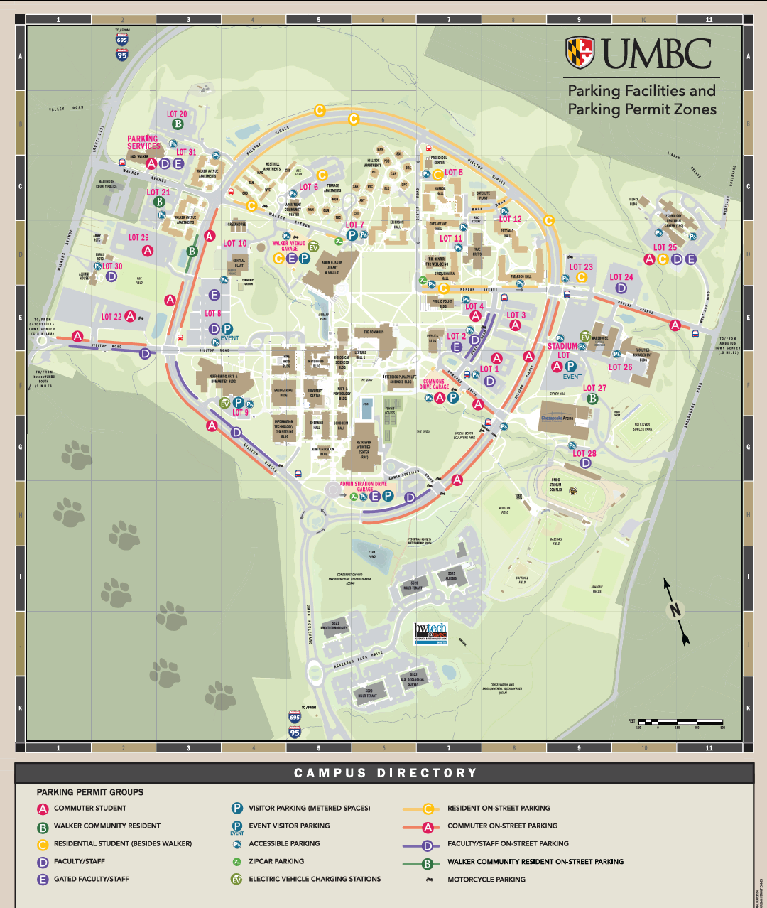
Figure C. i. And ii. Dissimilarity about layout, structure, content, functionality of the apps, This is the downloaded version of the UMBC Map that can be shared by students which is a great functionality. Just like its website/app that has Letters/Alphabets that correspond to Student versus Guest, Commuter versus non-commuter parking, it is detailed in the app with more clarity about the costs per parking with the time of pakings and office hours etc. This helps a person know where and when to park. Besides, it lets users easily and efficiently register three vehicles with their parking Alphabet. It also lets renew those Registered vehicles annually with no cost. Everything is transparent and no hidden or sudden fees unlike the Treano app that had surprising deductions. This map also shows transit stops so students can go to that page and see what times it operates. FAQs help UMBC students and images are retrieved from (UMBC Parking Services, 2025).
iii.
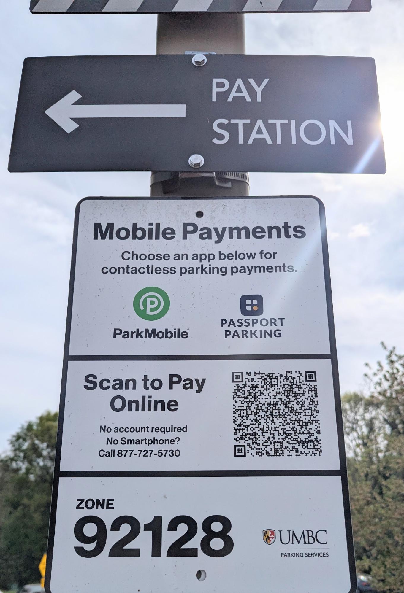
Figure C iii. Park Mobile Aps’s QR code for payments, Location, Zone number speeds up process.
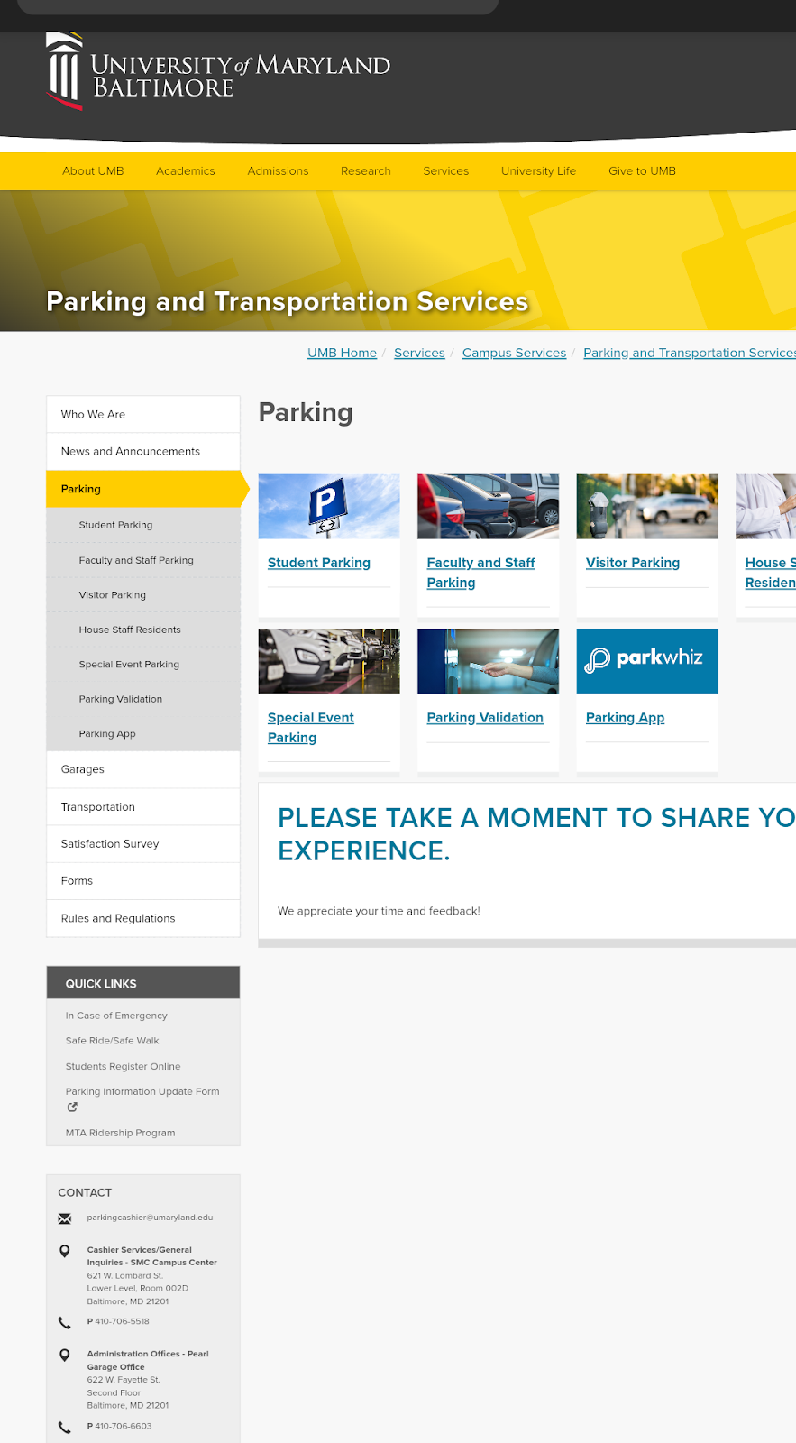
2. UMB Parking and Transportation Services
i.
Figure D. There are different tabs for various Parking Permits; however, instead of Alphabets, it says what each one is Like Student parking versus Faculty and Staff Parking etc. Resources, Services, Quick Links and Contacts are also Visible on this app from the Norman’s (2013) Design Principles. The Heuristics, and layout of the app are its Strengths because it minimizes the scroll compared to other apps since it is Modular grids. The feedback survey at the end is also an amazing feature on UMBC app (UMB Parking App. 2025).
3. CCBC Parking App
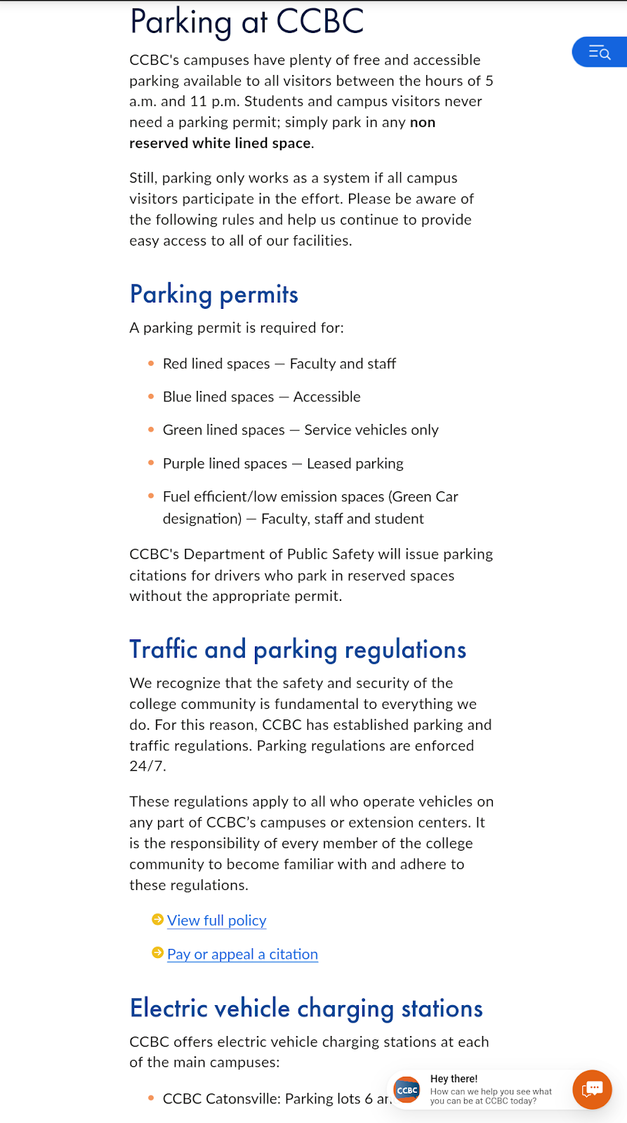
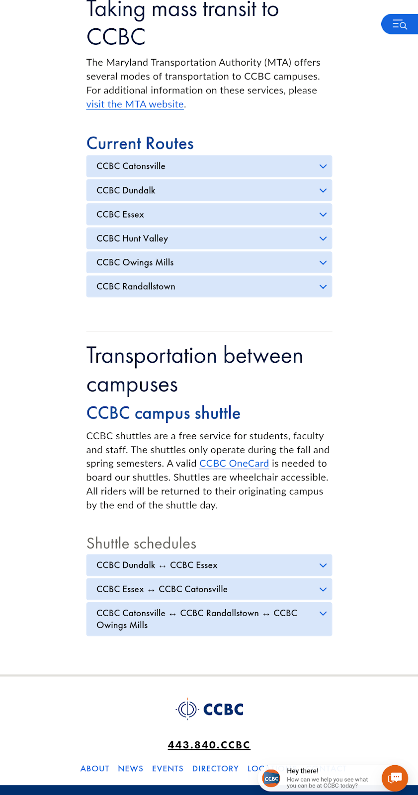
i. ii.
Fig E. CCBC has scrolling but it also has a lot of features, tabs or dropdowns of each location that opens transit and bus stop information for that particular location as a useful functionality to navigate and guide users and organize contents. The Current routes, traffic information and parking permits are also visible clearly that are differentiated by colors. Additionally, Electric Vehicle Charging station times are also mentioned in the content. The Help bot in Chat bottom right is a plus functionality and provides Help to users. Both images i and ii are retrieved from (CCBC Parking Permits, 2025).
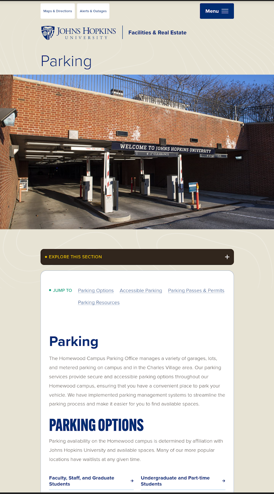
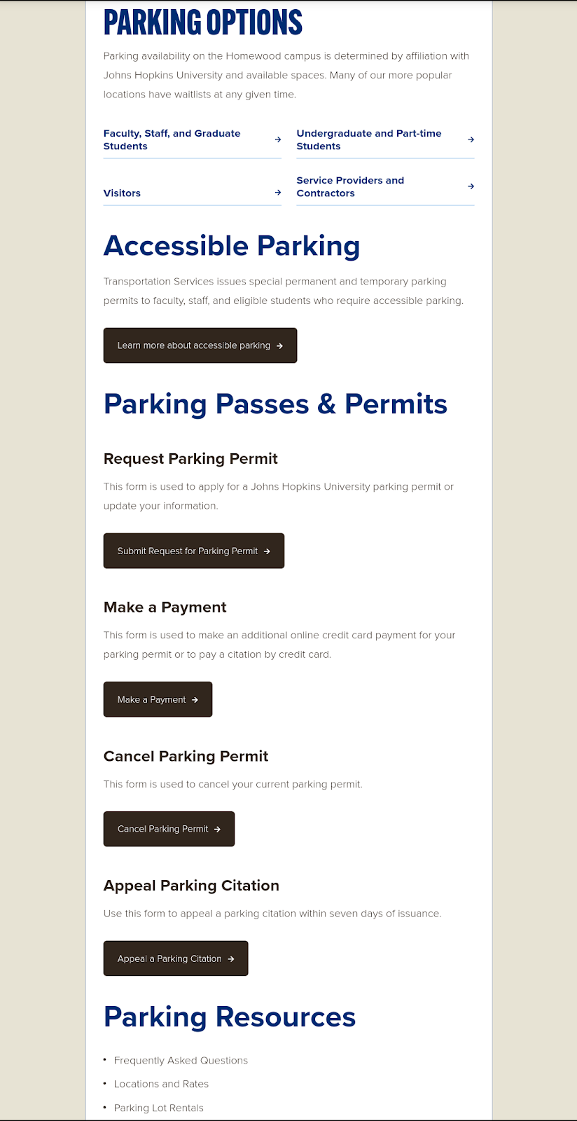
4. Johns Hopkins Parking App
i.ii.
Fig F. This app also has a ton of scroll but clarity and scannability are great like other previously compared apps. It has a transparent “Make a Payment,” “Cancel Payment Permit” and “Appeal a Parking Citation” Button, a functionality that provides Help to users. It also has permit information like others’ content that’s great. The JHU app shows how important it is to be transparent and have discoverable buttons and links besides information. Both images i and ii are retrieved from (Johns Hopkins University Parking, 2024).
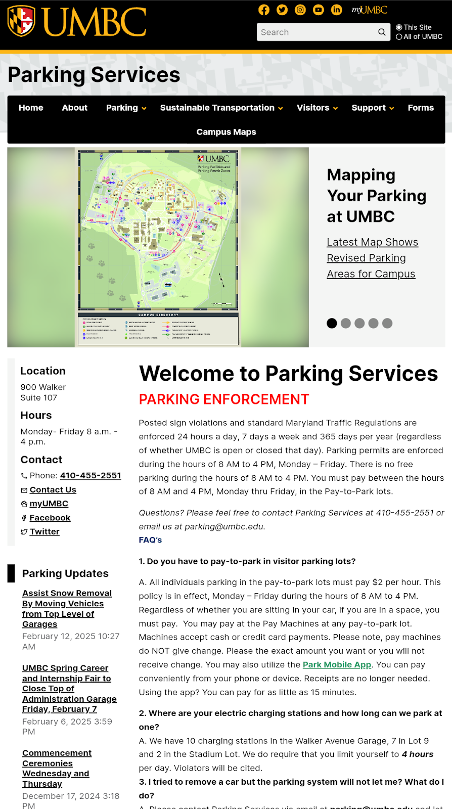
The UMBC Parking App. It offers a superior user experience compared to the Space Parking App through its intuitive design and comprehensive features. Its well-organized interface includes a visual parking map that clearly distinguishes between student, commuter, and guest parking using letters, enhancing navigation. Transparent pricing, detailed FAQs, and a direct link to Park Mobile for payments eliminate confusion, while real-time weather updates and transit stop information provide practical support. By allowing users to register up to three vehicles annually at no cost and presenting clear Maryland traffic regulations, the app aligns with user expectations and Norman’s Design Principles, delivering a seamless and frustration-free experience. Context is also important along with meeting user needs and goals; hence, images of all HE and best parking apps are shown in (Appendices A.5) in detail.
The UMB Parking App. It stands out for its clear navigation and user-focused design, addressing the shortcomings of the Space Parking App. By explicitly labeling parking permits for students, faculty, and staff, it avoids the confusion caused by cryptic codes, making it easier for users to find relevant information. The app’s Modular-grid-based layout minimizes scrolling, adhering to Norman’s Design Principles for visibility and feedback. Quick access to resources, services, and contact information further enhances usability, ensuring users can efficiently manage their parking needs without the excessive navigation challenges found in less effective systems.
The CCBC Parking App. It excels in functionality and user assistance, offering a robust alternative to the Space Parking App. Despite requiring some scrolling, it organizes content into clear categories, with dropdowns for each location that include transit and bus stop details. The app prominently displays Electric Vehicle Charging station times and color-coded permit information, aligning with users’ mental models. A standout feature is the real-time chatbot, which provides immediate help, addressing a critical gap in user support that the Space Parking App lacks, thus improving satisfaction and ease of use.
The Johns Hopkins Parking App. It delivers a transparent and accessible experience, far surpassing the Space Parking App’s unreliable payment system. It’s clear “Make a Payment” and “Cancel Payment” buttons allow users to complete transactions confidently, reducing frustration. The app’s scannable layout and detailed permit information ensure clarity, while its straightforward design minimizes errors. By prioritizing discoverable links and a user-friendly payment interface, it meets heuristic goals for efficiency and feedback, offering a model of simplicity and reliability that the Space Parking App could help to enhance user trust and satisfaction. The black long rectangular buttons with white colored text inspired my Figma High-Fidelity Prototype Button shape and colors for greater contrast as users are more likely to be curious to read and click such buttons and especially if they have more clickable space per Fitts’ law.
A.5.2. Why Users Would Prefer Competitor Apps
One of the main reasons why users of the space parking app would prefer the competitors is due to other apps meeting the primary goal: To provide easier parking payments and clear content to users. Transparency is the key and if that is missing in content on an app or website, then users do not understand the affordance and mapping of the app functionality. There are several best features that are found in the competitor’s apps that inspired my Redesign such as Help bot, Maps, and Electric parking or Zone information that could make the space app the best one if it takes these extra bonus points into consideration besides just improving its UARs and heuristics. Being transparent and detailed in providing information on apps is the most desired feature so far by users so the space app must work on adding details or more tabs. Furthermore, participants later did a cognitive walkthrough, but before that they helped me select these competitor apps for comparison. As mentioned earlier, one peer was a UMBC student and the other peer was not. Hence, UMBC and UMB parking apps were selected besides JHU and CCBC due to their familiarity with those apps. Incorporating these features into the Spaces app was best.
d. e. f.
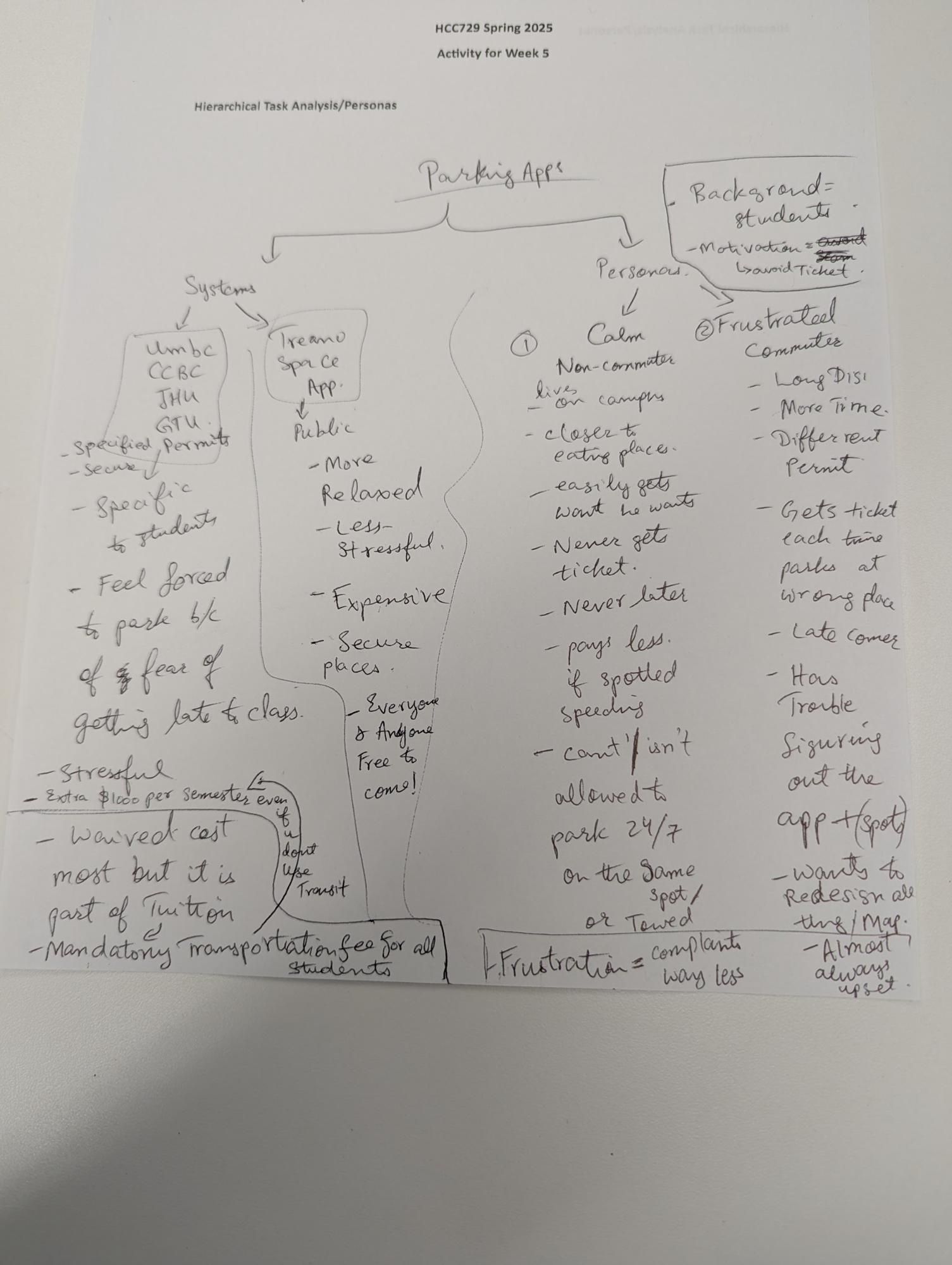
Fig. A.7. Draft of two Personas and hypothetical Scenarios to recruit Two Participants, who matched these user traits. For the Participatory Part of this study, Two Hypothetical Personas were created to recruit two similar participants with the traits detailed for each of the two created personas below:
Background/Context
Traits and Preferences:
Experience with Parking Apps:
Motivation:
Background/Context
Traits and Preferences:
Experience with Parking Apps:
Motivation:
__________________________________End of Appendices__________________________________